California has a rich architectural legacy and was the ideal location for the establishment of Suprstructur, an agency taking a fresh approach to real-estate. Through a uniquely immersive, editorial publication, the agency connects creative people with intriguing design-led properties.
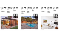
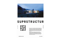
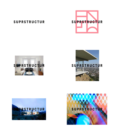
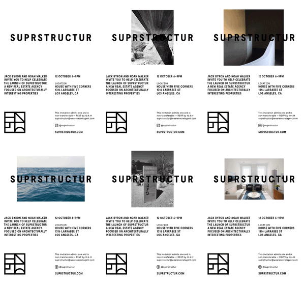
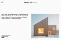
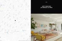
Tapping into the lifestyle and culture of international modernism, we created a bold logotype with considered spacing. Throughout layouts in print and online this is employed as a masthead in keeping with the editorial approach that Suprstructur takes in presenting properties.
The logotype is accompanied by an icon that references architectural attributes of the housing stock that Suprstructur showcases, which includes brutalism, midcentury modern and Spanish colonialism. Like building blocks, this symbol can be arranged in multiple configurations to suit different formats and situations and allow for variety across outputs.
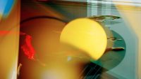
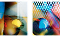
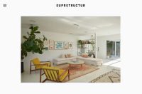
We commissioned photographer Leon Chew to create a set of layered, abstract images which focus on space and refracted light. These are employed across the website and marketing materials.
As part of our creative direction of the brand, the launch event included a specially-commissioned piece of contemporary dance.
